A short employee pulse score can be useful, but only if it tells you something you can act on. This article explains how the employee engagement net promoter score works, what it measures, how to calculate it, and where it falls short. I also cover how to run it cleanly in a UK workplace so the result reflects real sentiment rather than survey noise.
The quickest way to use eNPS well
- It measures how likely employees are to recommend the organisation as a place to work.
- Promoters score 9-10, passives 7-8, and detractors 0-6.
- The score is calculated as the percentage of promoters minus the percentage of detractors.
- Use it as a fast signal, not as a full engagement diagnosis.
- Segment by team, manager, location, and tenure to find the real story.
- Pair the number with comments and follow-up action, otherwise it becomes a vanity metric.
What eNPS actually measures and what it misses
At its best, eNPS tells you whether people would speak well of the organisation when they are not in the room. That matters because advocacy usually reflects some mix of trust, pride, and confidence that the workplace is worth recommending. The CIPD notes that variants of NPS are often used for this purpose, but employee engagement itself is broader than a recommendation score. That is the first trap I see leaders fall into: they treat a strong score as proof that everything is fine. It is not. A team can be proud of the brand and still be overloaded, underpaid for its market, or stuck with a weak manager. eNPS is good at capturing sentiment and willingness to advocate; it is not designed to tell you everything about workload, progression, inclusion, or psychological safety.In practical terms, the metric is best viewed as a directional signal. If it rises after a change, something probably improved. If it falls, something likely broke. What it cannot do on its own is explain why, which is why the question design and follow-up matter so much. That brings us to the mechanics of the score itself.
How to calculate it and ask the question well
The calculation is simple. Bain's original NPS model separates responses into three groups: promoters, passives, and detractors. eNPS uses the same structure, usually with one question such as: How likely are you to recommend this organisation as a place to work to a friend or colleague?
Use a 0-10 scale and classify the answers like this:
- Promoters 9-10
- Passives 7-8
- Detractors 0-6
The formula is straightforward: percentage of promoters minus percentage of detractors. If 58% of respondents are promoters and 17% are detractors, the score is +41. Because the score can range from -100 to +100, it is easy to track over time and easy to misunderstand if you look only at the number without the context.
I also recommend one open-ended follow-up: What is the main reason for your score? Without that, you get a dashboard number but no diagnosis. A second optional prompt - What one change would most improve your experience? - often gives you more practical value than the score itself. Once the question is clear, the next challenge is collecting answers without distorting them.
How to run the survey without contaminating the result
A clean eNPS process is more important than a perfect survey tool. If people suspect the score will be used against them, or if the wording changes every time, you are measuring caution rather than engagement. In a UK context, I would also keep the language plain and natural - "organisation" and "colleague" usually feel more authentic than heavily corporate phrasing.
These are the basics I would not skip:
- Keep the wording stable so you can compare one cycle with the next.
- Protect anonymity or people will self-censor, especially in small teams.
- Explain why you are asking and what will happen after the survey closes.
- Avoid tying the score to performance reviews because that turns feedback into self-defence.
- Do not report tiny groups if the result could be traced back to individuals; in practice, I would be cautious below 8-10 responses.
- Ask one or two follow-up questions only so the survey stays quick and repeatable.
Cadence matters as well. Too infrequent, and you miss change; too frequent, and people stop taking it seriously. For most organisations, a monthly or quarterly pulse is enough, with extra check-ins during major change programmes. The point is to create a reliable rhythm, not to chase the score every week. Once the data is clean, interpretation becomes far more useful.
How to read the score in a UK workplace
There is no universal “good” eNPS that works for every sector, size, or location. I would rather compare your own trend line than pretend there is a magic benchmark. In a hybrid UK organisation, differences between teams, managers, or sites are usually more revealing than the company average.
I use the following working bands as a practical reading guide rather than a hard standard:
| Score range | What it usually suggests | What to do next |
|---|---|---|
| Below 0 | More detractors than promoters; the organisation is losing advocacy | Investigate the main friction points quickly and look for localised breakdowns |
| 0 to +19 | Neutral or fragile sentiment; there may be pockets of goodwill, but not enough momentum | Check manager practice, workload, and communication before making broad claims |
| +20 to +49 | Solid support, but not necessarily consistent across the business | Find where the score is weaker and copy what works in the stronger teams |
| +50 and above | Strong advocacy and a healthy internal reputation | Do not relax; use comments and segmentation to spot hidden weak points |
The real value comes from slicing the result by team, tenure, location, contract type, or manager. A company-wide +35 can hide a frontline team at -12 and a leadership team at +68. That gap is usually where the operational issue lives. Once you know how to read the pattern, the next question is what to do with it.
What to do when the number changes
The number itself does not improve the workplace; the response does. When eNPS moves, I want to see a short, disciplined loop: understand the reason, decide what will change, tell people what you learned, and then check whether the change actually helped.
- Read the comments first so you do not overreact to a small numerical shift.
- Group the themes into a few clear drivers such as management, workload, growth, recognition, or process friction.
- Choose one or two actions per driver instead of launching ten disconnected initiatives.
- Assign an owner and deadline so the survey leads to behaviour, not just discussion.
- Close the loop with employees and explain what will change, what will not, and why.
One point worth stressing: a score drop is not always a failure. Sometimes it is simply the first honest signal after a reorganisation, merger, or policy change. That is why I look for trend breaks by segment before I make a leadership judgement. If one team falls sharply while the rest hold steady, the issue is local. If the whole company drops together, the problem is systemic. Either way, action beats interpretation. That naturally raises the question of where eNPS fits in the wider measurement set.
When eNPS is useful and when it is not enough
eNPS is useful when you need a fast pulse on advocacy, a simple number to track over time, or a lightweight way to see whether a change programme is moving in the right direction. It is also helpful when leadership wants one metric that is easy to explain without a long training session. Simplicity is a real advantage if you use it with discipline.
It is not enough when you need diagnosis. If the organisation has issues with burnout, weak line management, poor internal mobility, or uneven pay fairness, eNPS alone will not tell you which lever matters most. You will need deeper questions, manager-level feedback, and probably a fuller engagement index. That is where people sometimes overestimate the score because it is neat and underestimate the broader survey because it is less elegant.
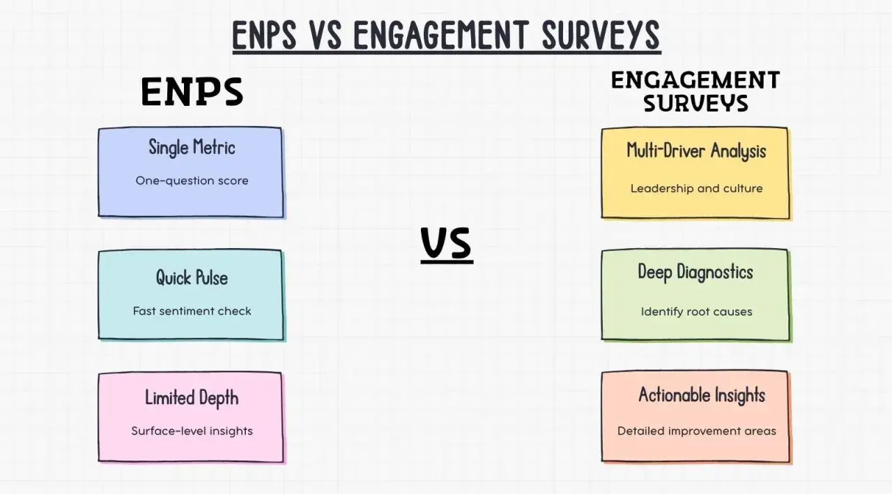
There is a useful distinction here: eNPS tells you whether advocacy is moving; engagement surveys tell you why. Used together, they are far stronger than either one alone. That leads to the measurement stack I would actually use in practice.
The measurement stack I would use alongside it
If I were building an engagement programme from scratch, I would not rely on one metric. I would use a small stack that gives me both speed and depth:
- One eNPS question for a fast advocacy signal.
- Three to five driver questions on topics such as manager support, workload, development, and recognition.
- One open-text question to capture the reason behind the score in the employee's own words.
- One or two business outcomes such as retention, absence, internal mobility, or regretted turnover.
That combination gives you a much cleaner read than a single headline number. It lets you see whether the score is being pulled down by a specific manager, a workload spike, or a missed development pathway, and it helps you avoid the common mistake of fixing the metric instead of the workplace. If you want the metric to stay useful in 2026 and beyond, treat it as an early warning system, then use the richer data to decide what to change next.